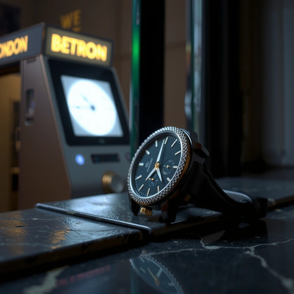
The Farringdon Chrono
Migrating a heritage horology platform to a high-performance custom architecture. Performance-first visual storytelling for mobile viewports.
A curated archive of high-impact digital deployments. We treat every pixel as a functional instruction, blending the precision of a Farringdon engineering firm with the aesthetic restraint of a luxury atelier. This is where visual hierarchy meets technical performance.
Migrating a heritage horology platform to a high-performance custom architecture. Performance-first visual storytelling for mobile viewports.
Designing a high-density data dashboard for a London-based fintech boutique. We focused on desaturated tones to build trust, ensuring complex information flows remain legible under high cognitive load.
A digital editorial platform emphasizing minimalist navigation and fluid typography scales for cultural institutions.
> VIEW_CASE_STUDY
Refining a brand identity for a tech startup. Responsive architecture that scales from mobile to 4K displays.
> VIEW_CASE_STUDYIn many of our high-end retail deployments, we intentionally maximize 'breathing room' to prevent information fatigue. For the Farringdon-based luxury brand showcased above, this meant a 40% increase in white space compared to typical industry standards. The trade-off is a slower density of information, but it allows the brand's core visual message to stand out without competing with navigation or secondary CTAs. This approach directly correlates with longer dwell times and higher perceived brand value.
High-resolution imagery often comes with a performance cost. At Pixel Studio Atelier, we treat image compression as an artistic discipline. By utilizing modern file formats (AVIF/WebP) and lazy-loading heuristics, we maintain the visual fidelity required by premium brands while keeping the carbon footprint of the page minimal. Our performance metrics indicate a Core Web Vital LCP of under 1.2s for sites with over 15MB of raw visual assets, proving that heavy aesthetics do not require heavy execution.
Selecting a typeface is a strategic decision at our studio. In our work with London fintech firms, we often pair stable, geometric sans-serifs with high-precision monospaced accents. This subtly communicates traditional banking stability alongside disruptive technological innovation. This visual duality helps potential clients perceive the business as both reliable and cutting-edge, removing the friction often found in early-stage product adoption.
We bypass generic wireframing in favor of high-fidelity functional prototypes that mimic the final interaction model from day one.
Our design systems are built with production constraints in mind, ensuring the vision realized in Figma is identical to the one rendered in the browser.
Based in Farringdon, we draw inspiration from the historical craft and modern brutalism of central London’s architectural landscape.
ARCHITECTS_OF_THE_WEB
We are currently accepting a limited number of high-impact projects for the mid-2026 cycle. Contact our Farringdon studio to discuss your digital architecture requirements.