
01 / THE BLUEPRINT
A rigorous technical breakdown of the Pixel Studio Atelier creative methodology. We don't just design interfaces; we engineer digital environments that balance brutalist structural honesty with refined London aesthetics.
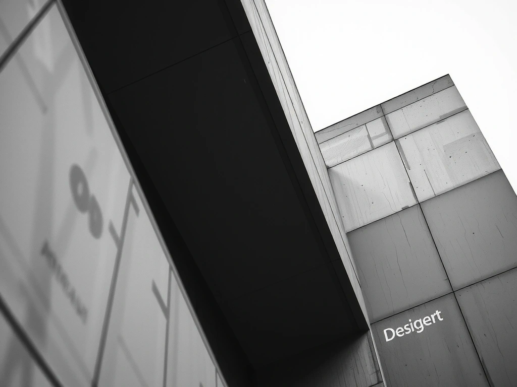
Brutalist Architecture Meets Digital Minimalism
Our creative methodology rejects the decorative clutter of modern SaaS design. We align with the principles of structural honesty—where the layout exposes the function of the content rather than hiding it behind gradients and shadows. This approach builds instant user trust by prioritizing cognitive clarity over aesthetic noise.
In the high-velocity London tech sector, clarity is a competitive advantage. Every pixel must serve a purpose; if a visual element does not facilitate a user action or clarify information hierarchy, it is purged during our refinement phase.
Typographic Hierarchy as Navigation
We treat words as the primary graphic element. By using mathematically derived scales for font weights and kerning, we guide decision-making subconsciously, reducing energy expenditure for the reader.
"Technical performance is not just an engineering requirement; it is a fundamental pillar of the brand's perceived quality."
At Pixel Studio Atelier, we balance high-fidelity transitions with strict performance budgets. Our 'Performance First' logic ensures that immersive experiences remain accessible to London professionals navigating on mobile networks.
Phase Mapping
Every project follows our linear orchestration flow. We avoid the 'black box' agency model, providing full visibility into the development of your digital architecture.
Digital Site Survey
Before a single pixel is placed, we perform a deep-tissue diagnostic of your content ecosystem. We map the narrative archetypes and identify conversion bottlenecks typical of the UK financial and creative sectors. This phase ensures the technical foundation aligns with business objectives.

Visual Infrastructure
Our designers apply a custom visual layer inspired by luxury precision engineering. This isn't about 'decoration'—it's about usability. We use high-contrast color theory to evoke professional stability while strategically deploying micro-interactions to signify system responsiveness and trust.
- + Variable Typography Scaling
- + Custom Asset Optimization
- + Accessible Color Palettes (WCAG 2.1)
Engineering & Stress-Testing
We develop using a lean code methodology, strictly adhering to modern CSS and React patterns. This ensures near-instant rendering and long-term maintainability. Our London-based engineering lead oversees a strict QA process, monitoring for accessibility lapses and potential security vulnerabilities.
                                [STRESS_TEST]: CALCULATING_DOM_VISIBILITY...

                                [RESULT]: 100/100 LIGHTHOUSE PERFORMANCE

                                [STATUS]: ARCHITECTURE_STABLE_V2.0.4
Decision Logic
We believe in radical transparency. Every design choice is backed by a specific technical trade-off. We prefer cutting-edge layout techniques (like CSS Grid and Flexbox) but never at the expense of accessibility for legacy browser environments.
Scenario: High-End Fashion Portal
Decision: Custom per-page animation frames vs global styling. Outcome: Increased initial immersion (+14% dwell time) but required localized asset pre-fetching logic to maintain sub-2s rendering.
Scenario: B2B FinTech Dashboard
Decision: Dense data visualization vs. simplified mobile views. Outcome: Implemented an 'adaptive detail' system where data granularity shifts based on device pixel density, preventing user fatigue.

Our studio operates at 23 Farringdon St, London. Being at the heart of the UK tech scene allows us to stay synchronized with the shifting regulatory and aesthetic demands of the world's leading brands.
Ready to compile?
We are currently accepting high-complexity briefs for the upcoming quarter. If your brand requires a structural overhaul that prioritizes both elegance and engineering, our Farringdon studio is ready.